Think More

Think more before filling, before choosing a typeface, before scrolling, before making room for strange prejudices. Every week, a short reflection on design, motion and style, good habits and bad ones, the contradictions of communication, the ideas that become trends. As a compass, the masters of yesterday read inside our present.
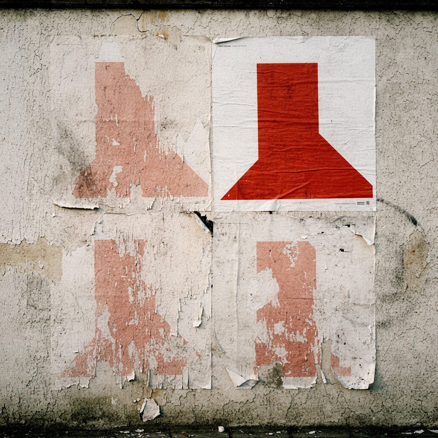
Four identical posters with a red mark pasted on a wall: three worn away by time, one intact
Always the same, thankfully
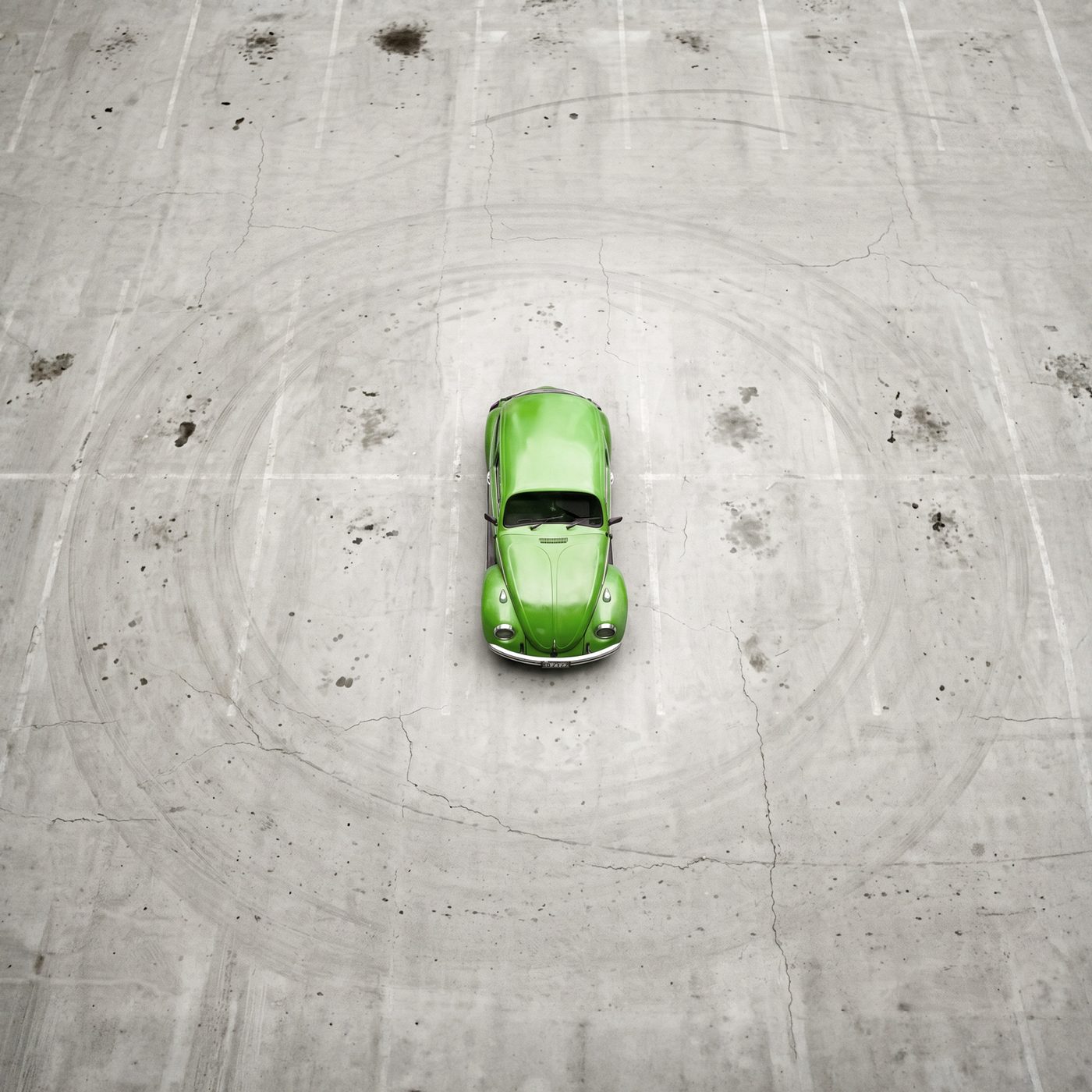
A green Beetle seen from above, alone in the middle of an empty concrete parking lot
Think Small
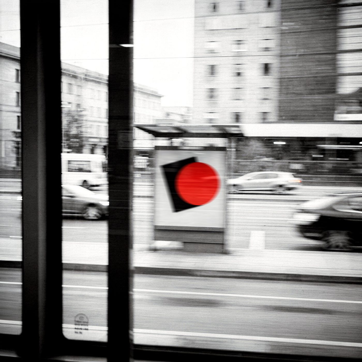
A poster with a red circle seen from the window of a moving tram, blurred black and white city
Reading without reading
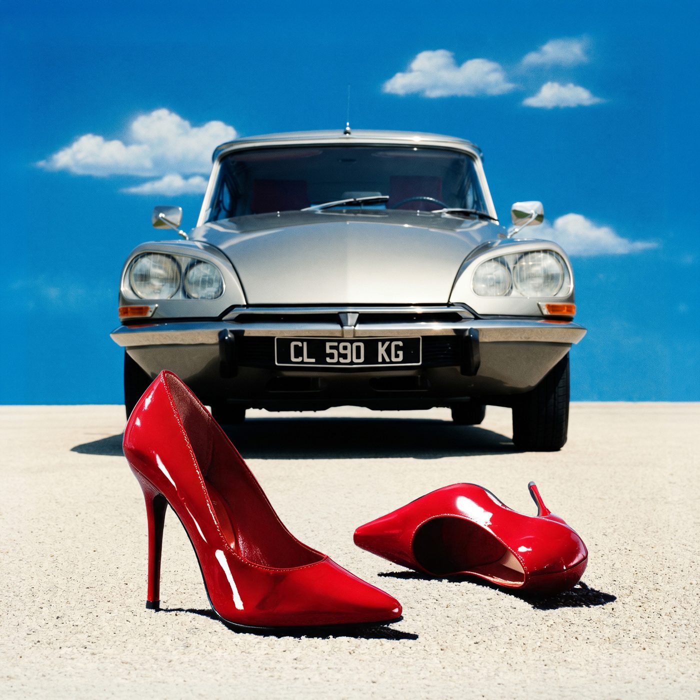
A pair of red high heels in the foreground in front of a Citroën DS under a deep blue sky
The photo that wasn't there
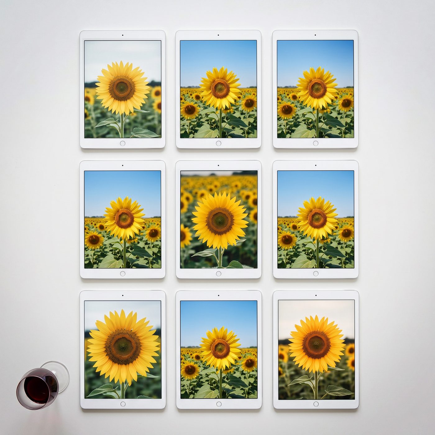
Nine iPads on a wall showing nine nearly identical photographs of a sunflower, a glass of wine in the corner
New tool, old eye
A blue triangular road sign with a green X in a landscape of fields and sky
Red gets there first
A bare branch with a few leaves in a glass vase, raking light on a grey background
One thing only
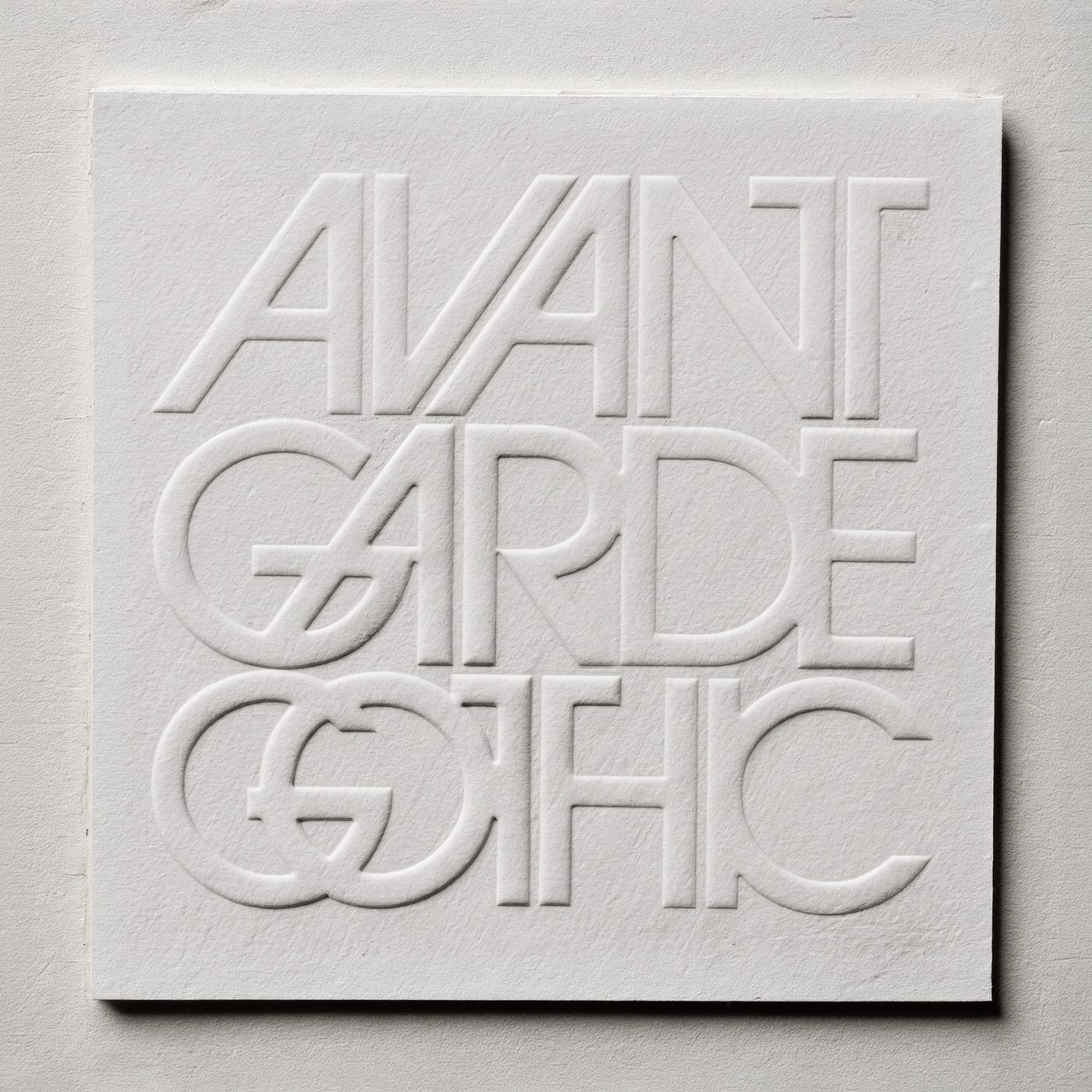
The words Avant Garde Gothic blind-embossed, white on white paper
It sounds the way it's set
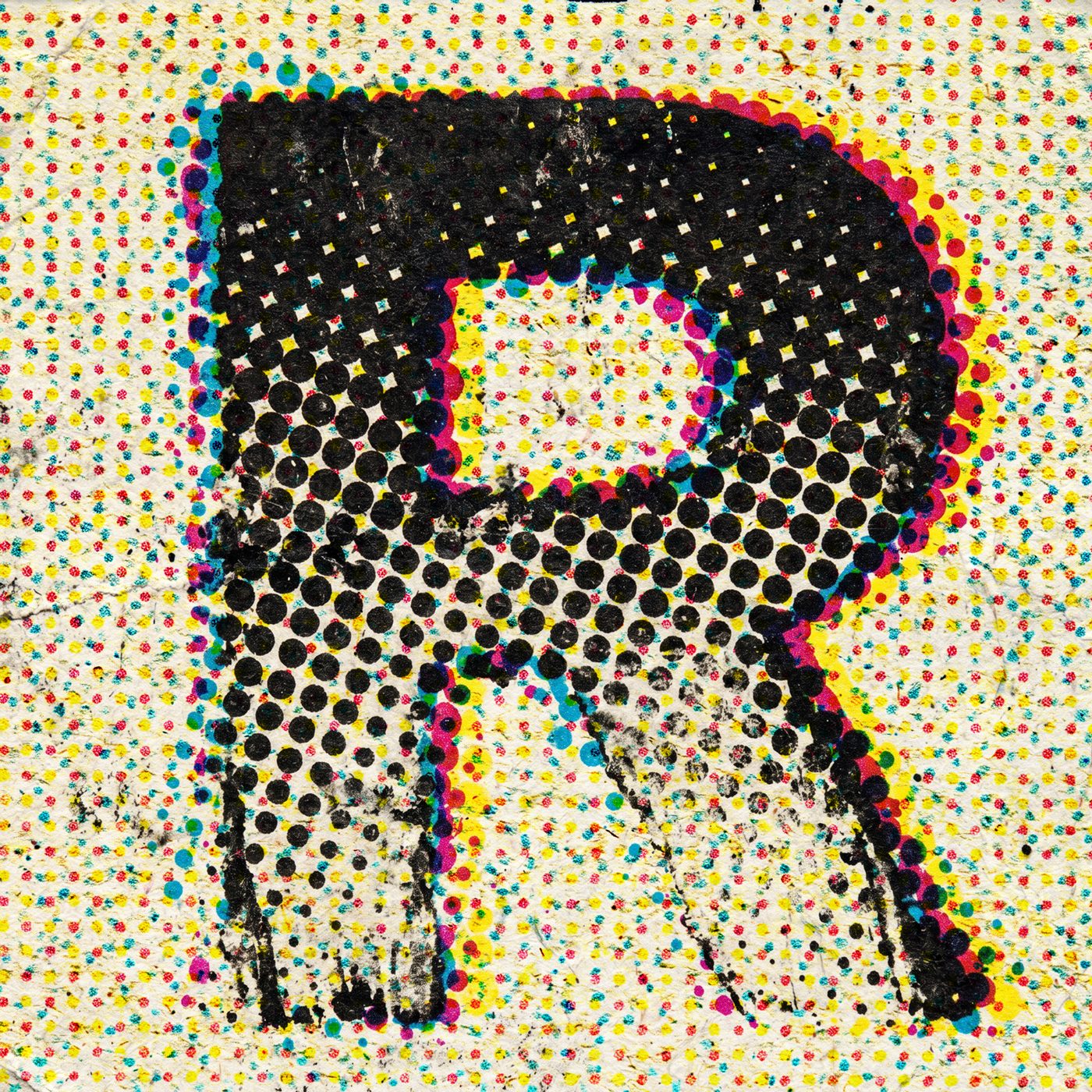
A large letter R printed in halftone dots, black over misregistered CMYK on fibrous paper
The trained eye
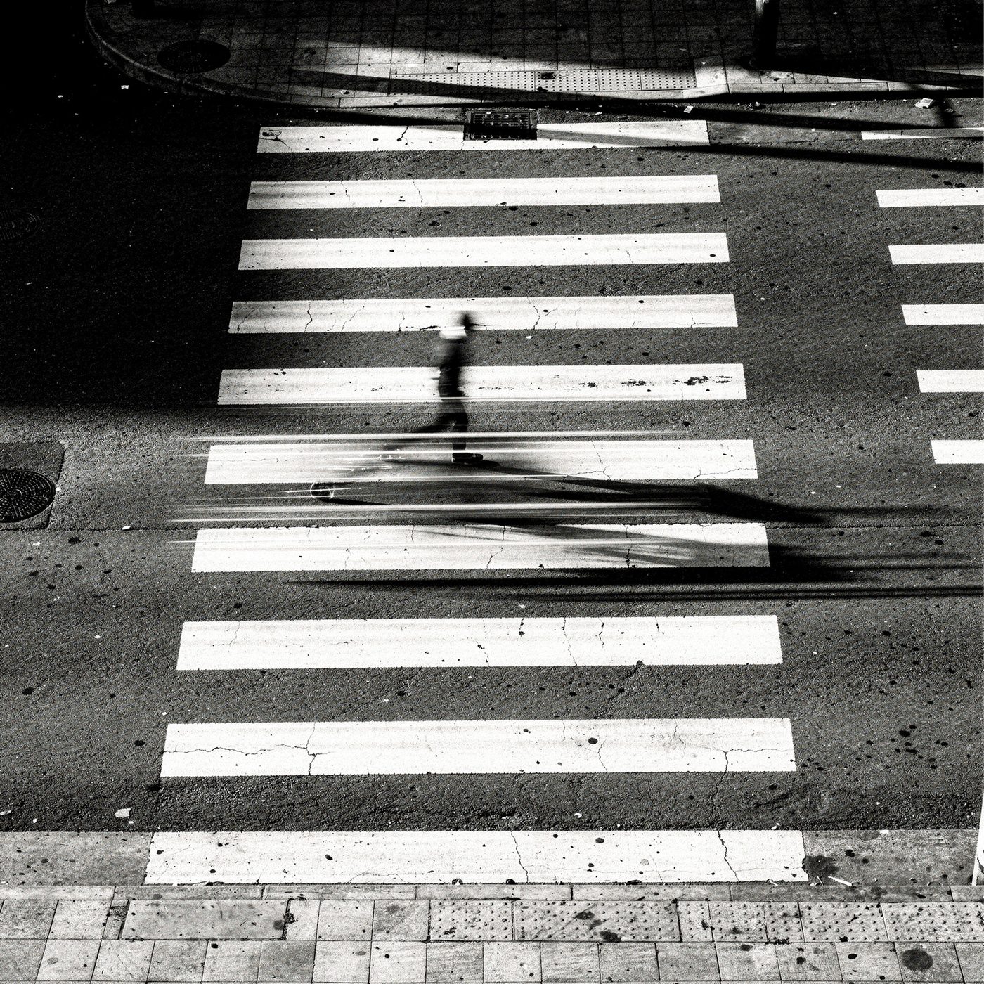
A pedestrian crossing seen from above with a blurred figure in motion
What moves, leads